Sunday, August 31, 2014

Flying Unicorn Mixed Passion - Palette

The Flying Unicorn Mixed Passion Add On always includes a canvas along with an assortment of mixed media goodies. This month's kit also includes a wooden painter's palette and set of paintbrushes. I love the look of altered, paint-splattered palettes, but wanted to give mine a spin on that theme - a Tuscan colour palette (one of my absolute favourite colour combinations).


I started by spraying my background in various shades of yellow and orange. Once it was dry, I added stencilling with gel medium through a 12x12 stencil to preserve some of the lighter background colours. I then added stencilling through a 6x6 stencil of the same colour with Shimmerz Dazzlerz for a pop of colour. Some dribbled Silks, darker sprays, splattered Inklingz and Texturez through the 6x6 stencil from the kit finished off the background.


I wanted my paintbrushes to look used, but to not be so covered in medium that they blended into the background, so I sprayed them with some green mist and added some chalk ink.


This cute little wooden bird was in the Small Passion, Big Art kit this month. I coloured him black using chalk ink, then added in the highlights with a white Sharpie. Curling the trailing edge of my Prima vine gave both the bird and the paintbrushes a nice place to rest.


I finished it off with a Prima IOD paintable card from the kit which I coloured with Prima Chalk Edgers and a wet paintbrush.

Thank you for stopping in today. If you haven't yet picked up your September Kit, get while the getting's good! Want to make sure to not miss out next month? Check out our handy Kit Pre-Order feature - in most cases domestic customers will have their kit delivered around reveal day!

Supplies Used:

From the Kit and Add Ons:

- Wooden palette and paintbrushes
- Shimmerz Texturez: Artie-choked
- Prima 6x6 Stencil
- Wooden Bird
- Prima Chalk Edger: Olive Vine
- Petaloo Berry Spray: Red
- Prima IOD paintable 4x6 card
- Shimmerz Inklingz: Burnished Buckle

From my stash:

- 13 Arts Mists: Chalk Yellow Lemon, Pearl Orange, Chalk Yellow Amber, Chalk Burnt Sienna
- Prima Stencils: 12x12 Checkers, 6x6 Checkers
- Shimmerz Dazzlerz: Lemon Drop
- Silks: Ginger Peach
- Shimmerz mists: Olive Branch
- Prima Chalk Edgers: Black Coal, Coltsfoot Stemens, Rose Bud, Pastel Peach, Pastel Brown
- Sharpie Poster Pen: White
- Prima Lady Bird Vine


Saturday, August 30, 2014

Flying Unicorn Reveal - September Your Passion, Your Art Kit

Hello Uni's and friends!

We are THRILLED that our September Guest Designer is the seriously talented and very sweet Gabrielle Pollacco!!!! Yes! Gabrielle is joining us once again at Flying Unicorn to share her creativity and inspiration using our September Kit. On September 01, 2014 we will share her incredible inspiration , until then we are thrilled to present our September Your Art Your Passion Kit of the Month.


From the beginner to the avid mixed media artist our Mixed Art add on kit will surely please you. Our Mixed Art kit will always come with a canvas and this month we have included a circle canvas ready for you to get your mojo going. Oh and an extra special wooden paint palette has been included for you to use or alter with paints Flying Unicorn Adornments and mists galore.


Flowers, chipboard, and vines oh my! Our Mixed Passion is a collection of everything pretty to add to the Main kit or the add on kits. The colors and embellishments will enhance your Kit of the month creations or it can stand alone and you can create something magical! So turn the music up order that pizza for the family and lock your self away while you create some pure yumminess!


Our Small Art Big Passion is all about the love of making cards, tags atc's and anything in between. With the 6x6 collection of Studio 75 , Flying Unicorn Adornments, more flowers to a vine metal die manufactured by Cottage Cutz, sweet hellos, welcome to fall, thank you, and birthday cards , will be reaching friends and family doorsteps soon.


We are thrilled to present great tutorials, techniques, videos and Build a Page using our September Kit of the Month to help you grow in the passion of your art. So stay tuned there is so much more to come in the next week!


Kits and Add On Kits are limited so do not delay in getting yours!

Prima August BAP

This month's Prima BAP sketch was created by none other than the extremely talented Jen Snyder, a personal friend of mine. For those of you who know Jen, she is an incredible artist, as well as being one of the most genuine, friendly, encouraging crafters out there, and I couldn't resist playing along with her sketch (I printed it out at the beginning of the month and it took me until now to fit it in, but I was determined to get it done).

Without further ado, here is my take on the sketch:


And the lovely sketch itself:


I used lots of yummy Prima goodies on this one. I flipped the sketch to be able to keep the lighthouse image on the Shell Postage paper visible (figuring it could also pass for an air-traffic control tower for my son's foam plane). After layering on some strips cut from the Seashore ATC cards I covered everything with a coat of clear gesso and went to work adding layers of Color Bloom mists, white gesso, resist canvas, stamping, and finally swirls of Wire Thread (love this stuff!).

Here are a couple closeups:


Thank you so much for stopping by. Many of the Prima goodies I used are available at the Flying Unicorn Store, and I've added hyperlinks to help you where applicable in case you want to pick something up.


Products Used:

- Prima Seashore Paper: Shell Postage
- Prima Seashore 6x4 ATC Pad
- Liquitex Gesso: Clear and White
- Prima Color Bloom sprays: Tea Stain, Antique Gold, Gold Foil, Lime Wedge
- Prima Chalk Edgers: Shabby Tote, Branch Bark, Rose Bud, Brick Wall
- Prima Stamps: Stitched Lines, Script
- Prima Resist Canvas Borders
- Prima Wire Thread: Teal
- Prima Resin Icons
- Prima Seashore Flowers: 574949, 574963
- Prima Mini Sachet Roses: 565954
- Prima Mechanicals: 961145
- Prima Bulbs

Tuesday, August 26, 2014

Industrial Birthday Card - Blue Fern Studios

What kind of card maker are you? Are you always prepared with a box of pre-made cards, or are you a last-minute card maker? I have to confess, I'm the latter. Most of the time if we have a party to go to, you will find me a half hour before, at my craft table, with supplies strewn about, madly trying to whip something up.

This past weekend was a double-whammy for us - our niece's first birthday and one of my son's friends' eighth birthday. I had a pre-made girly card, but I find boys cards difficult, and didn't have anything on hand. I decided to do something industrial - what do you think?


To start with, I adhered a piece cut from Blue Fern Studios' Mini Rings Panel to a piece of cardstock. I then layered over foil tape from the hardware store, and worked it down into the depressions using flower styluses. Don't worry if the foil tape tears a little when you do this, it adds to the worn, industrial feel.


I then added several shades of blue and green Alcohol Ink to the foil, and worked over it with some Blending Solution. When the alcohol ink was dry, I added some Izink in Bamboo randomly, and baked it on with my heat gun. The Izink goes on matte, which adds a nice visual contrast to the shininess of the foil tape and alcohol ink.


I created the strap with some leftover foil tape which I adhered to cardstock and ran through the sewing machine, then coloured with alcohol ink.


A couple metal accents finished everything off.


Blue Fern Studios Products:

Mini Rings Panel

Thanks for stopping in today! For my friends in the Northern Hemisphere, I hope you're enjoying the tail end of summer. It's still going strong here, and the kids and I are squeezing every last drop of fun we can out of it!


Wednesday, August 20, 2014

Flying Unicorn's Playdate Thursday - Saving Mixed Media Backgrounds Gone Wrong


Awhile ago on the Flying Unicorn Forums we asked the members what types of tutorials they would most like to see, and several people asked for tutorials on how to salvage a mixed media background that had gone sideways. Let's face it, anyone who plays with mixed media has occasionally had a layout go off the rails. You might think that the only option is to trash the whole thing, but I hate to see hours of work go down the drain, so I tend to doggedly press on, pulling out some tried and true techniques to salvage what I've invested my time in. Let's face it, paper is cheap, and easily replaced, but time is valuable, and speaking for myself I hate wasting time.

First things first, though. If you aren't already in the practice of covering pages you are intending to use different media on with clear gesso, I can't recommend strongly enough that you start. I have a video on Worry Free Misting on the Flying Unicorn forums to take you through the reasons for doing so in case you missed it the first time around.

One thing to keep in mind when you are debating whether to trash a layout or to continue working with it is that your background is generally a foundation. Whether you love it or hate it, it is a starting point; one that you are likely to cover up with your photo, embellies and possibly additional layers of paper. It is only a part of your whole. Creating is also a process; recently I saw a great post on Facebook about the creative process that certainly applies to me (paraphrased to keep it G-rated):

Creative Process

1. This is awesome!
2. This is tricky.
3. This is crap.
4. I am crap.
5. This might be okay.
6. This is awesome.

Here are some strategies for bringing a mixed media layout back into line. Every one may not work for every layout, but they give you options. Most are geared towards breaking your problem area into smaller components so it is less noticeable.

1) Add a contrasting/complementary colour. For instance, I recently had a layout where bright yellow got away from me. By adding stamping in dark blue I broke up the assault of the yellow.

2) Add neutrals: You can add black, white and/or brown. Neutrals break up the colour and give your eyes somewhere to rest.

3) Add pattern(s) - whether with masking, doodling or stamping, patterns will draw in the viewer's eye and break up the "mistake".

4) Add in more of your problem. It sounds counter-intuitive, but a big splotch of a mistake on one part of your layout will stand out. Although it's hard to do, adding in additional splotches will help the one mistake not to stand out. You're working on correcting your "mistake", and you will apply the same treatments to any additional spots you add.

5) Add splatters. Splatters can be black, white or any colour(s) of your choosing. Black and white serve to add some neutral, whereas adding splatters of colour can help your colour choice look deliberate, even if it was originally a mistake.

6) Add paper layers. By strategically placing your layers and photo you can hide the worst of your problem area.

7) Add embellishments.

8) Select a photo that complements your background. Depending on the colours you've used on you background you may need to change your photo (or print it in black and white).

Generally when I have to salvage a layout it is already "ruined" when I start the process. For the purpose of this tutorial, I created a background, and then systematically set about ruining it (and then making it even worse). It was a very strange journey for me, but again, I am too stubborn to give up midway through, and I think I pulled it off in the end. It might not be my all-time favourite layout, but it's good enough, and sometimes that's okay.

Alright, so let's dive into it! Here's the background I started with (it is covered with clear gesso, but I resisted the urge to give it the full wipe down).


First misstep - I added copious amounts of red/pink misting (I think it looks a bit like I bled all over my layout - ick!)


Okay, so generally I would stop here and start trying to salvage the layout LOL, but for your benefit, I made it worse. Why not add some blue to the mix?


It's looking pretty bad now. Let's try to start putting it back together!

First off, I added in some black, with a stencil and Distress Ink so that I could fade out the pattern at the end. Because Distress Ink is water-reactive, I then sealed the background with Workable Fixative - there's no going back now!


Next I added in some white, using a circle stencil and modelling paste.


Okay, things are starting to come together and it's looking like a bit less of a hot mess.

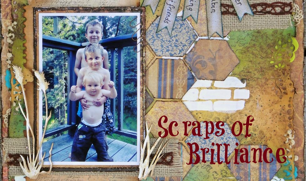
The next picture shows a couple steps. I added in another colour, green. I started assembling some paper layers. And I selected a photo that featured the colours I'd used in my background. The bold colours of the photo also help the lighter shades in the background fade into the background even more.


And then I really started to build my paper layers, adding foam tape to some areas for dimension. You can see how as I add layers they break up the big blob of my original mistake, and it seems much less overwhelming. To prevent the paper layers from looking out of place, I edged them in blue and green.


Then I added my finishing touches: splatters of blue, black and green mists, a flowering vine and some fussy cut butterflies to help break up some troublesome areas. And voila!


Thank you so much for stopping by today! I hope I've been able to share some helpful techniques with you.

Supplies Used:

- Prima Princess collection papers
- Shimmerz mists: Caribbean Sunset, Cotton Candy, Lime In Da Coconut
- Faber-Castell Gelatos: Blueberry
- Ranger Distress Ink - Black Soot
- Prima stencil: 12x12 chevron
- 13 Arts Modeling Paste
- Heidi Swapp stencil
- Prima Chalk Edger - Rock Moss
- 13 Arts Mists: Pastel Black, Chalk Blue Light
- Prima Lady Bird Vine (565503)
- Webster's Pages Alphas
- Faber-Castell Art Journaling Pen Small